Brand guidelines.
A short reference for keeping Needham Market FC looking and sounding like one club. Use these guidelines for matchday graphics, sponsor materials, social posts and print.
The Crest
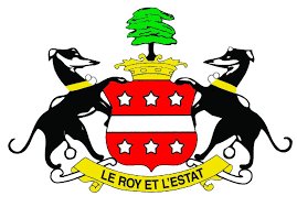
The greyhounds crest is the heart of the brand. Always give it clear space, keep it legible, and use the full-colour version wherever possible — on cream/light or on the dark ink background as shown.
Colour Palette
Red is the signature, used boldly but sparingly for impact. Cream is the everyday background; ink is the primary text colour. Keep plenty of breathing space and strong contrast.
Typography
Voice & Tone
One club, one community. Proud of the Marketmen and Bloomfields, welcoming to everyone, and rooted in Suffolk. Warm and human — never corporate.
Signature phrases:
Photography
Use genuine club photography — Bloomfields, the stands, matchday and academy — with natural light and the red/black/cream palette coming through. Favour authentic, atmospheric images of players, supporters and the ground over stock imagery.